Not long after the printing of the first Bible by Johannes Gutenberg in 1456, commercial block presses were soon churning out all manner of texts from religious and philosophical works to the classics, Reformation pamphlets, travel guides and even romantic novels.
The quality and accuracy of many texts began to improve. So too, did the type and techniques for producing them. Printing as a profession became a well-respected artisanal craft – and one worth protecting from competitors.
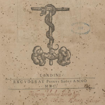
Some of these ornaments and marks were so prized that they were passed or sold on to other printers when one printer died or retired. For example, two pocket devotionals printed by Henry Denham in 1581-2 featuring pages ‘surrounded by a four-piece border of exquisite design,’ together with another design best described as a ‘chain border, a square alternating with an oval and linked together by a ring, the top and bottom pieces being finished off with a star at either end,’ were both passed on to Denham’s successor, Peter Short, and afterwards in turn, to his successor (whom Short’s widow married) Humfrey Lownes.
EARLY TRADEMARKS SIGNALLING COPYRIGHT
Printer’s marks became a way for printers to to identify a particular printer – or group of printers – and in the early days when this technology was still becoming established and copyright was not yet ‘a thing’, the craftsman and artisanal printers who prepared these works for publication, wanted a way to protect their books ‘from the pirate.’ hence the development of printer’s marks.
The oldest verified printers’ mark dates back to 1462. Fust and Schoeffer, printers from Mainz, used it in a Bible. These marks were used almost since the first years of printing. There is an earlier example in their Mainz Psalter (1457), however, it is suspected to be a later addition.
At first, these devices were purely used as trade marks. However, after a while, people soon began to discern their ornamental value, and, consequently, employed the best available artists to design them. Enter the printers’ ornament, which in many ways, signalled the start of graphic design and was also the precursor for what would later become the book-plate (Ex-Libris).
These would usually be added to the frontispiece or end of a book and served as a kind of visual signature of sorts, a mark of quality and authenticity, much like an artist signing their work. In this way, they became an important bibliographic device helping people to trace the the identification of unknown printers and authors across time and space.
PRINTERS’ MARKS
Printer’s marks were not unlike a trademark, helping to identify a particular printer – or group of printers – and in the early days when this technology was still becoming established and copyright was not yet ‘a thing’, the craftsman and artisanal printers who prepared these works for publication, wanted a way to protect their books ‘from the pirate.’ hence the development of printer’s marks.
At first, these devices were purely used as trade marks. However, after a while, people soon began to discern their ornamental value, and, consequently, employed the best available artists to design them. Enter the printers’ ornament, which in many ways, signalled the start of graphic design and was also the precursor for what would later become the book-plate (Ex-Libris).
These would usually be added to the frontispiece or end of a book and served as a kind of visual signature of sorts, a mark of quality and authenticity, much like an artist signing their work. In this way, they became an important bibliographic device helping people to trace the the identification of unknown printers and authors across time and space.
Printers Ornaments

A printer’s ornament, also known as a dingbat, dinkum or printer’s character, is a decorative glyph used in typesetting. These ornamental elements usually served an aesthetic purpose, rather than be used to convey a specific meaning (although there are always exceptions).
Many can trace their roots back to the illuminated manuscripts of the medieval period, especially the embellished drop caps found at the beginning of a chapter, and became very popular as printed books took off during the Renaissance, became more complex as printing technologies developed in the 16th and 17th centuries, right through to their decline at the end of the eighteenth century.
Printers’ ornaments served a mainly decorative function, enhancing the visual appeal of printed materials. Similar to flourishes, they could be found at the beginning or end of chapters, where they were known as headpieces or tailpieces.
The earliest form of printer’s marks were usually simple visual devices known as dingbats or dinkums. Some included decorative initials or other embellishments such as flourishes. These could be created as part of the typeset or made from woodcut blocks.
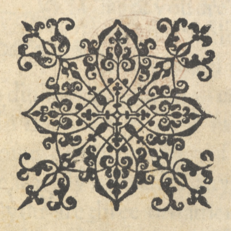
Some of the most popular ornaments were essentially ornamental forms of typography, known as printers’ flowers, or fleurons. These are ornamental pieces of type that resemble floral motifs such as a fleur de lys and are designed to be used both for punctuation and to add a touch of elegance to a page layout.
Fleurons were crafted the same way as other typographic elements were: as individual ‘fonts’ that could be fit into the printer’s compositions alongside traditional letters and numbers. This saved the printer time and effort in producing ornamentation. Because fleurons could be produced in multiples, printers could build up borders with repeating floral patterns.
In England, many of these designs started out quite plainly, but soon evolved from the simple tooled flowers originally used to embellish book bindings, into sophisticated head- and tailpieces and initial letters, often depicting elaborate scenes. No doubt, many aspects of this technique were inspired by the illuminated manuscripts painstakingly created by monks, which often included techniques like decorative drop caps and elaborate borders.
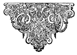
HEAD & TAIL PIECES
Later, printer’s ornaments took on a functions that went beyond simply being decorative. For example, the introduction of so-called Head & Tail Pieces.
According to Henry Plomer:
As their name implies, the object of these blocks or ornaments was to fill blank spaces at the beginning and end of divisions in the text, such as Dedicatory Epistles, Prefaces, Sections of a work, or Chapters. They were also frequently placed above and below a colophon.
This fashion did not catch on in England until the sixteenth century (Plomer puts it at around 1560-1570), and so were not used by the first generation of printers such as Caxton. Many of these were fleurons that were built up from single ornaments to form head and tail pieces. Indeed, Plomer asserts that ‘the individual fleuron was worked into bewildering variations.’
Before the advent of specially-made head and tail blocks, it had not been uncommon to use of some kind of ornament at the bottom of a chapter, or the end of a book. Plomer claims that the earliest tail-piece ever used by any English printer was ‘a single fleuron of especially large size, and perhaps cut in wood and not metal, three of which arranged as a reversed triangle is frequently seen in books at an early date in the sixteenth century’. (Plomer, Ch. VI) Another early example cited by Plomer can be found in A Treatise made by Athanasius … in what manner ye may use the Psalmes, which was bound up with the Book of Common Prayer, both printed by Richard Jugge in 1573.
Another ornament used as a tail-piece in the sixteenth century may be best described as the ‘lozenge’ ornament. Like the ‘fleuron’ it was apparently a stock pattern, supplied to all printers alike from quite the beginning of the sixteenth century. It is found on the Continent, and also in the offices of Wynkyn de Worde, Pynson, Richard Faques, and others. An example can be found in the 11th edition of Henry VI, believed to have been printed in about 1540 by Robert Redman.
Other popular designs included the ‘ribbon’ ornament, consisting of ‘two pieces of ribbon interlaced into circles and squares, a five-pointed star being placed in the centre of the circles and a flower in the centre of the squares,’ which can can be found in a book printed by Vautrollier in 1579.
During the seventeenth century the small ornaments already noticed as used for borders to title-pages—the star, the rose, the crown, the thistle, the fleur-de-lys and the acorn, cast in various sizes—shared with the fleuron the duty of supplying head and tail pieces, or dividing sections of a book.
Plomer, English Printers’ Ornaments
After circa 1580, more ‘legitimate head and tail pieces—that is, blocks of a decorative or pictorial design, especially cut for the purpose’ came into use.
These ran to all sizes, from blocks measuring 139 by 34 mm. for head-pieces in folio books to others measuring only 47 by 12 mm., these last being used independently as head-or tail-pieces, or as ornaments for the title-page. The larger ones are rarely found used elsewhere than in their rightful places.
Before their advent, any odd blocks that had done duty in books of hours or primers on the Continent, and had been bought by some English printer on his annual visit to the Frankfort Fair, were pressed into service as head and tail pieces.
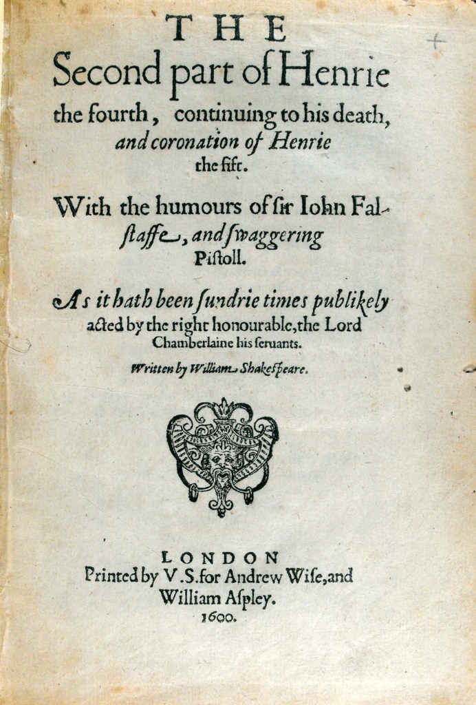
GREEN MAN – A COMBINATION OF BOTH?
This is where our green man comes in.
A combination of printer’s mark, and the nature-inspired fleurons of printers ornaments, our green man is heart- or trifolate-shaped like a leaf, but includes a face that resembles the foliate-headed grotesques often found in the corners of cathedrals and gothic buildings, including Rosslyn Chapel in Edinburgh. This mischievous nature spirit embodies a play on words – covered by the stems and leaves of nature, he graces the pages (or ‘leaves’) of a book.
BEWARE OF IMITATIONS
In the quest to trace the ‘lineage’ of these green man blocks, Plomer sounds a word of caution:
Before the close of the sixteenth century specially designed head and tail pieces of all sizes were in general use, and continued so throughout the following century. When I add that every good block was immediately copied, and frequently copied so faithfully that it needs almost microscopical examination to discover the difference, some idea will be gained of the wide field of illustration thrown open in this branch of our subject.
English Printers’ Marks, Chapter V
